Tuesday 20 May 2014

Creating An iPod in Cinema 4D

First, we had to create the actual iPod. I did this by adding a cube object to the stage and adjusting it's properties to shape it like an iPod. I then added a plane object and tube object to the stage and did the same, adjusting the properties of each object to suit the needs. In this case, the plane became the screen and the tube became the menu. I also needed to adjust the positions of the plane and tube, otherwise they'd both be center inside the iPod. Then, in the Objects Manager, I selected all  three objects and grouped them together. That way I could shift all three objects without hassle. I added another plane object next and adjusted it's properties to create a floor for the iPod to rest on.
Now, I had an iPod shape and floor for it to rest on but no colour. So, I created four new materials and changed the colours of two of them and the textures of the other two. The colours I changed were black to use as the floor colour and then green to use as my iPod's colour. As for the textures, I used two, premade textures, one of an iPod menu and the other of an iPod screen. Then, I applied each texture to each object.
Finally I added a light object to the stage and adjusted it's properties and position. Below is the finished result.


Tuesday 13 May 2014

Computers In Art And Design

Here are 10 examples of how Computers can be used in Art and Design, alongside the programs used.

       1. Websites

Websites are one of the most, if not the most, widely used examples of Computers in Art and Design. People can either set up their own website through other websites that host the site for either a small fee or even some do this for free. Usually this method is only for setting up a forum or a blog. Otherwise, you could use specific programs to create your website, such as Adobe Dreamweaver.


       2. Computer Games/Video Games

Specifically 3D Computer Games or Video Games. These are more widespread examples as almost everyone has either heard of, owned or at the very least played a Computer/Video Game. Companies exist to create these games and create new consoles to play them on, so there's a very large market with these. Valve is a good example, they produce many 3D titles, such as the Left 4 Dead series, the Half Life series (which saw the most improvement in terms of looks) and the Portal series. The most common software for creating these games is Autodesk 3ds Max


       3. 3D Movies

3D Movies have taken over the movie industry, replacing the old 2D animation styles. Disney, Pixar and Dreamworks are probably the biggest companies in the Industry but there are still many others out there. A good example of the software used to create this is Autodesk Maya


       4.  Advertisements
Adverts are everywhere in the world. In newspapers, on billboards, on the internet and so forth. There's quite a few programs you can use to create Advertisements but, the best known one is Photoshop, as there's a good range of tools to use.


       5. App Games
Almost everyone today has some form of mobile device. Smart Phones, Tablets, Kindles and so forth. And almost all of these devices have some form of App store that allows you to obtain these games. Whether they're free to play or purchased for a small fee,  App Games are a big part of modern society now. Most App Games are now created with Java.
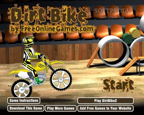


       6. Flash Games
Flash Games can easily be found on the internet. They're games played in the web browser that can be small, addictive time wasters, or big adventure games and have a range of genres. Whether you're looking for a creepy horror game or a big RPG or even a cute little Barbie game for your children or siblings, Flash games cover it all. The biggest software used for this is Adobe Flash.


       7. Illustrations, Logos and Typography
All three of these things are seen world wide both on and offline. You can find them in newspapers, on TV during adverts, on websites and even flyers, for example. Each of these three can very easily become created in software such as Adobe Illustrator.


       8. Magazines and Newspapers
Magazines and Newspapers are widespread sources of information and gossip throughout the world. Whether you want to hear about a celebrity break up or about the financial state of the country, either piece of information is easily obtained. To create the layout for them, you can use Adobe InDesign


       9. Audio and Music
Music is everywhere. From catchy pop tunes and edgy rock ballads in the charts, to little jingles at the end of an advert that stick in your head, music is all over and comes in many varieties. To create the amazing (and sometimes not so amazing) songs we hear, you need the right kind of software, such as Avid Pro Tools.


      10. Film Making/Video Production and Special Effects
If you're trying to spice up your little home movie or trying to create a serious project you need the right kind of Special Effects. While you can always use free software, like Windows Movie Maker, you don't quite get the professional looking effects. For those, you'll need something more like Adobe After Effects, Apple Final Cut or even Sony Vegas Pro.


Learning To Use Cinema 4D

First, I added the three shapes needed by going to Objects and then Primitive. The objects were all automatically placed at the '0' XYZ coordinate so I had to move them. I did this by using the Coordinate Manager. For my Sphere I changed the Z position to 300m and for the Cone I did the same but changed it to -300m.
Next, I added a floor by going to Object and then Scene and selecting floor. As the floor was also placed automatically at '0' XYZ I went to each of my objects and changed the Y position to 100m in the Coordinates Manager.
Now, to add colours to my objects and floor, I had to use the Materials Manager and selected New Material. To make obtaining colours easier I used the colour table and the colour I wanted for my Sphere. Then, I dragged the thumbnail from the Material Manager to the Sphere's icon in the Objects Manager. I repeated the process and created two more New Materials and selected the Cone and Cube's colours, then dragged each thumbnail to the shape I wanted. Next, I went back and, using the Material Editor, checked reflection and adjusted the brightness to 20% for each of my objects.
For the floor, I created a New Material then went to Texture, Surface and finally Checkerboard. Next, as with the shapes, I selected reflection and changed the brightness to 20% before I dragged the thumbnail from the Material Manager to the floor's icon in the Objects Manager.
Finally I added an Omni Light Object then adjusted it's position with the Coordinates Manager, changing the values to 500m on the X axis, 350m on the Y axis and -300 on the Z axis. I used the Objects Attributes Manager to increase the light intensity to 150% and apply a Soft Shadow Map. Below is the finished result.


Tuesday 25 March 2014

Scanning, Adjusting Size, Contrast and Colour of Patterns

In this lesson we learned how to scan in an image and make adjustments to it. First, I chose a pattern from my sample book to scan in, which you can see here.


The scanner had to be set to 150dpi resolution and the image saved as a JPEG. Then I opened the scanned image in photoshop and set the crop tool to the size of A5 paper, with a 150 pixels/inch resolution. Once this was done I cropped the image and adjusted the levels to increase contrast. Next, I opened a new Photoshop canvas at A3 size with a 150 pixels/inch resolution. Then I adjusted the hue four times by going to 'Image' then 'Adjust' and then funally 'Hue/Saturation.' Each time I changed the hue, I copied and pasted it onto the A3 canvas, putting them all together. Once all four were pasted, I saved the image as a JPEG and printed it out, so I could later cut them into A5 pieces and add them to my sample book.

Here is the finished result:


Tuesday 25 February 2014

Creating Brushes

This lesson we learnt how to make our own brushes in photoshop.
First, we had to choose an image to work with, in my case I chose the butterfly you see above.  Then I had to use the selection tool to select the area around the butterfly. Because my image was too big, I had to size it down. But, once I'd done that I could go to Edit and Define Brush Preset and name it Butterfly Brush. Then, I went to the brush tool and selected my new brush from the pull down menu. Once that was done I could adjust the spacing, shape dynamics, size jitter and angle jitter for my brush, plus alter the hue jitter. Here is my finished result:


I also created a brush from Building Blocks:

And one final brush using an image of my favourite Fate/Stay Night character:


Tuesday 11 February 2014

Wood Grain Pattern

This week we learnt how to create a Wood Grain Patterned image in Photoshop.

The first step was to draw an image with duel lines, so it was almost in a stencil fashion. We could go over the lines with a fine liner to darken them if we wanted. Then, we scanned the image in and opened it in Photoshop. If need be, we could use the Levels and Curves tools to adjust the light and dark within the image. Then, we used the bucket tool to fill in where colour was needed.
The next step was to find an image of wood grain and save it. Then we had to desaturate the image by going to Image, Adjustments and then finally Desaturate. Next, I changed the background on Photoshop to a new layer and placed the wood grain layer beneath this layer.
Then I changed the layer's properties to Linear Burn and this was the final result.


Tuesday 28 January 2014

Painting In Photoshop

Today we were looking at creating images in Photoshop to look like still life paintings. We were to draw a basic image of an object, in my case a simple cup. Once we scanned the image in and put it on our computer, we opened it in Photoshop. If need be, we could alter the curves or levels to brighten the image or darken the lines. Next, we changed the brushes to Dry Media Brushes and altered the brush's opacity. Then, using the Magic Wand tool we selected the area's of the image we wished to colour. Then it was just a case of layering on the colour the same way you'd layer on paint.
Here's my finished result.

Tuesday 7 January 2014

Posterising

For this lesson, we learned how to posterize images. This was the image I chose:

The first step was to go to Image, Adjustments and then Posterize. I adjust the levels and decided the posterization looked best with 5 levels. This was the result:

Next, I went to Image then Mode and Greyscale to change the image to black and white. Then  I went to Image and Mode again but this time selected Bitmap. I changed the frequency to 35 and got this result:

Then I copied this image by going to Select All and then Edit and Copy. I then used Step Back to return to the posterized image with colour. From here, I pasted the greyscale image on top. Then used the layer tools to change the layer's mode to Overly. That had this effect:


Finally I added a new layer and used the gradient tool with a radial gradient to add a blue and yellow gradient to the image. I moved that layer between the Greyscale layer and the original layer and then changed the opacity to 56% This was my final result: